 Marketing · Conversion
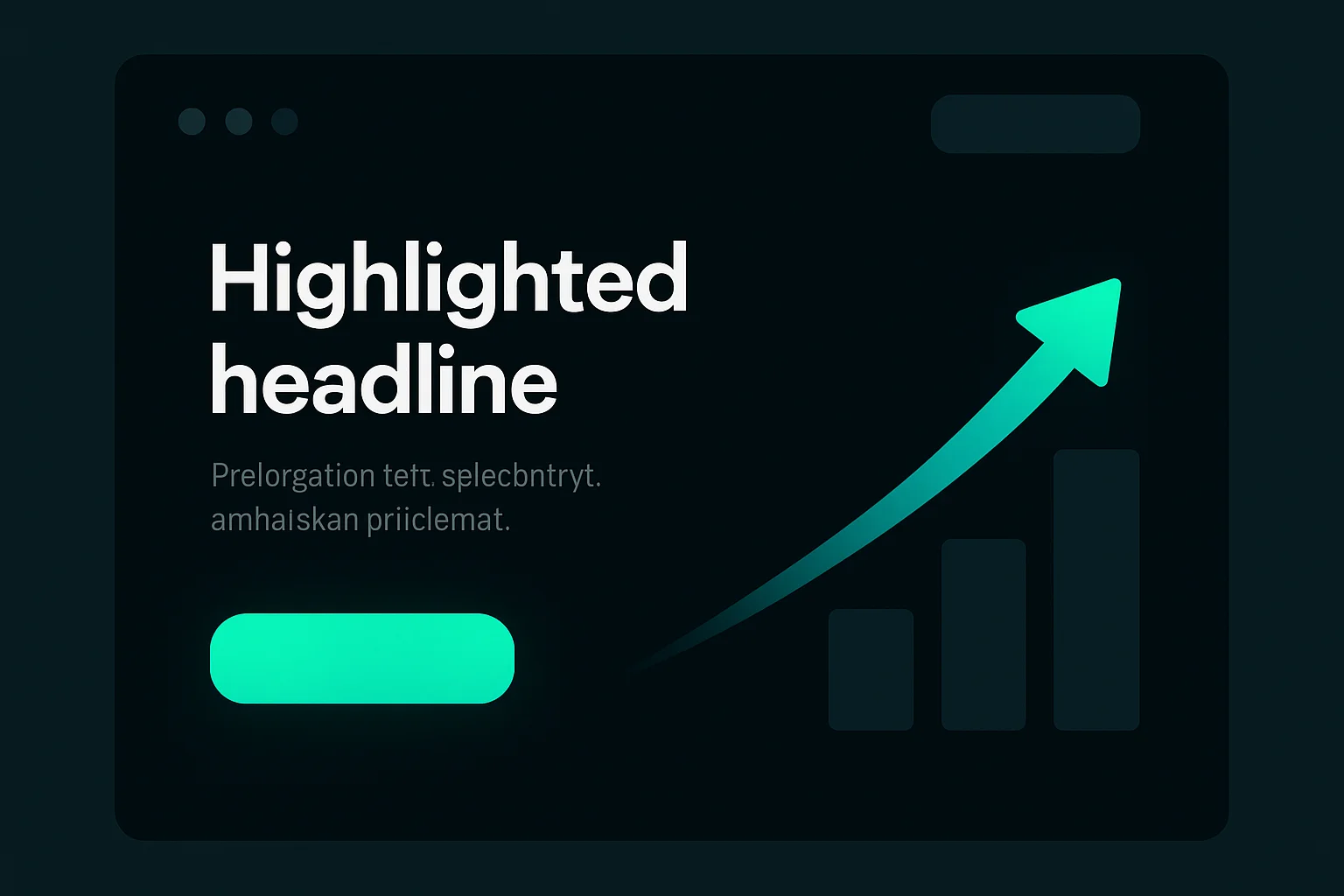
The Anatomy of a High-Converting Sales Page: 10 Elements That Turn Visitors Into Customers
In This Article
Most business pages are brochures. They describe. They tell you who the company is, list what it does, and point you toward a phone number. And then they wonder why the traffic doesn't turn into customers.
A sales page does one job: it moves a stranger from "just looking" to "I'm in." The difference between the two isn't magic, and it isn't slick design. It's structure. Every page that reliably converts has the same skeleton underneath — the same ten bones, in roughly the same order. Learn the anatomy and you stop guessing.
Here are the ten elements, what each one does, and what most local businesses get wrong on it.
Most pages are brochures — not sales pages
Here's the tell: if your page is trying to do five things at once — introduce the company, list every service, show the team, link to the blog, and maybe get a sale — it's a brochure. A brochure informs. A sales page persuades one specific person to take one specific action. Those are different jobs, and the second one is where the money is.
You don't need a bigger ad budget to fix this. You need the page you already have to do its job. That's the cheapest growth there is — and it's usually the leak nobody's looking at.
1. The headline — sell the outcome, not the thing
Make them feel the result they came for
The greatest headline ever written proves the rule. Domino's didn't say "great pizza, quality ingredients, family recipe." They said "Fresh, hot pizza delivered in 30 minutes or it's free." Not one word about the pizza. It spoke to exactly what a hungry person wants: pizza, and they want it now. That single promise built a billion-dollar company.
Speak to what your customer wants on the other side of the purchase. A plumber's headline isn't "Welcome to Joe's Plumbing" — it's "Hot water back on today, or we don't charge the call-out." A med spa's isn't "Advanced aesthetic treatments" — it's "Walk out looking like you, ten years rested." Low-ticket or high-end, the rule is identical: sell the transformation, not the service.
If your visitor reads only one line, this is it. Roughly 80% of the page's job lives in this single sentence — so write it last, rewrite it ten times, and make it about them.
2. The subheadline — make the promise believable
Answer "how," or kill the first doubt
The headline makes a bold promise. The subheadline earns it. Its job is to add the mechanism — the reason the promise is credible — or to remove the objection that just popped into the reader's head.
"Hot water back on today" is the hook. "Licensed local techs, same-day service, upfront pricing before we start" is the subhead that makes it believable. Headline grabs; subhead reassures. Together they buy you the next thirty seconds of attention.
3. The hook — name their pain out loud
Prove you understand before you pitch
Before you sell the fix, prove you understand the problem. Say the thing your customer is feeling — the dread, the frustration, the quiet cost of doing nothing — better than they could say it themselves.
When a reader thinks "yes, that's exactly it," something shifts: you've earned the right to offer a solution. Skip this and even a great offer feels like a stranger shouting a pitch. Agitate the real problem first, then relieve it. That's the emotional hinge the whole page swings on.
4. Proof — show it works, don't claim it
Nobody believes you about you
They believe other customers. Reviews, star ratings, real testimonials with names and faces, before-and-afters, results, recognizable logos, "500 local families served since 2009." Proof is the single biggest lever most local pages leave lying on the floor.
Don't quarantine it on a "Testimonials" tab nobody visits. Stack proof next to every ask — right under the headline, beside the offer, next to the button. Every time you make a claim, back it with evidence in the same eyeful. Trust is what converts, and borrowed trust from happy customers is the strongest kind you have.

Nobody believes you about you. They believe other customers — so stack proof next to every ask.
5. The offer — stack the value, anchor the price
Don't list features — build an offer
Features tell people what something is. An offer tells them what they get, what it's worth, and why the price is a no-brainer next to that value. Those are worlds apart.
Spell out exactly what's included, attach real value to it, and let the price land after the value has stacked up. When the perceived value dwarfs the number, the decision makes itself — the customer isn't weighing "is this worth it," they're thinking "how is this so cheap." That gap is where the yes happens. (This is the whole art of Alex Hormozi's $100M Offers — worth the read if you sell anything.)

When the value stacks up higher than the price, the decision makes itself.
6. Risk reversal — take the fear off their shoulders
Answer the "what if I get burned?"
Every buyer is quietly asking one question: what if this doesn't work, or I get burned? A guarantee answers it out loud. "Love it or your money back." "We fix it right the first time, or we come back free." "Not thrilled in 30 days? Full refund, no questions."
You take on the risk so they don't have to. Bold guarantees convert because they signal genuine confidence — you don't offer one if you're worried you'll owe a lot of refunds. The stronger and clearer the promise, the easier the yes. Just make sure it's one you can actually honor.
7. The call to action — one action, repeated
Tell them exactly what to do — over and over
One clear next step, said the same way, many times down the page. Not "learn more / contact us / maybe browse around." A single, specific action: "Book your free estimate." Big button. Action words. Zero ambiguity about what happens when they click.
Then repeat it — after the headline, after the proof, after the offer, at the end. People make the decision at different scroll depths, and the button needs to be right there when they do. Confusing the reader with three competing actions is the fastest way to get none of them.
8. Urgency & scarcity — a real reason to act now
"I'll do it later" is where sales go to die
A reader who leaves to "think about it" almost never comes back. Give them an honest reason to move today: limited spots this month, a price that genuinely goes up, a bonus that expires, only so many installs a week.
The key word is real. A fake countdown timer that resets when you refresh doesn't create urgency — it destroys the trust you just spent eight elements building. When your scarcity is true, say it plainly and let it do its work. When it isn't, don't fake it.
9. The FAQ — kill the last objections
Objection-handling in disguise
The FAQ isn't filler at the bottom of the page. It's your objection-handling section wearing a friendly costume. Every question that quietly stops a sale — "how much, how long, what if it doesn't work, do you even serve my area?" — gets answered here, in plain language.
Answer the hard ones honestly. The FAQ is often the last thing a serious buyer reads before they commit, and a straight answer to the scary question is frequently what closes the deal. Dodge it, and they leave to go find the answer somewhere else.
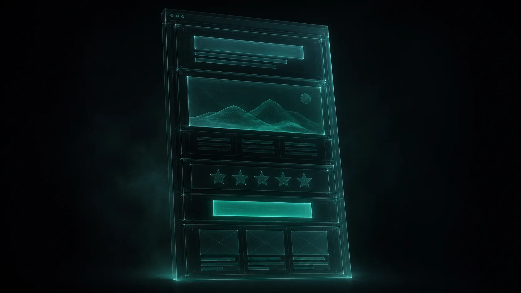
10. Visual focus — one page, one job, no exits
Confusion doesn't convert — clarity does
A sales page is not your homepage. Strip the navigation. Kill the escape hatches — the menu, the "our team" link, the social icons that lead people away right before they buy. Every element on the page should point to the one action you want.
Clean hierarchy, generous whitespace that guides the eye, fast load, mobile-first (most of your visitors are on a phone). The more choices you give a visitor, the fewer they make. Take the choices away and leave one obvious path forward, and more of them walk it.
These ten aren't a menu to pick from — they're a sequence. Headline earns the read. Subhead earns the scroll. The hook earns trust. Proof makes it real. The offer makes it desirable. Risk reversal makes it safe. The CTA makes it easy. Urgency makes it now. The FAQ removes the last doubt. And visual focus makes sure nothing pulls the reader off the path. Miss one bone and the skeleton wobbles.
Here's the part most owners miss: you almost never need more traffic to sell more. You need the traffic you already have to convert better. Ten well-placed elements can double the customers a page produces without spending another dollar on ads — which is exactly why the page, not the ad budget, is usually the real leak. For the copywriting that goes inside these bones, see our guide on website copy that converts, and the bigger picture in the 4 levers of growth.
The cheapest growth isn't more traffic — it's a page that converts the traffic you already have. A free GrowthLeaks audit shows you exactly where visitors drop off, so you can fix the leak before you spend another dollar.
Frequently Asked Questions
A regular page describes — it tells people who you are, what you offer, and where to find you, like a digital brochure. A sales page does one job: move a specific visitor to take one specific action. It's built around a single outcome, strips out distractions and navigation, and repeats one clear call to action. A homepage can afford to be a hub with many links; a sales page cannot. If your page is trying to do five things at once, it's a brochure — and brochures don't convert.
The headline. It does about 80% of the work, because most visitors decide whether to keep reading in the first few seconds. A great headline sells the outcome the customer actually wants — not your product or your company. Domino's didn't say "great pizza"; they said "fresh, hot pizza delivered in 30 minutes or it's free," and it built a billion-dollar company. After the headline, proof (reviews and testimonials) is the biggest lever most local businesses leave unused.
In almost every case, yes. Every buyer is quietly asking "what if this doesn't work, or I get burned?" A guarantee answers that fear and takes the risk off their shoulders — "love it or your money back," "we fix it right or we come back free." A bold guarantee signals confidence and reliably lifts conversions. The stronger and clearer the risk reversal, the easier the yes. Just make sure it's one you can honor.
Track two things: how many people land on the page, and how many take the one action you want (a call, a booking, a form, a purchase). That percentage is your conversion rate. If you're getting traffic but few actions, the page — not the traffic — is usually the problem, and it's the cheapest thing to fix. A free GrowthLeaks audit shows you where visitors are dropping off on your site and Google Business Profile, so you can fix the leak before you spend another dollar on ads.